Jaspit ID
Category: Branding & Identity




About The Project
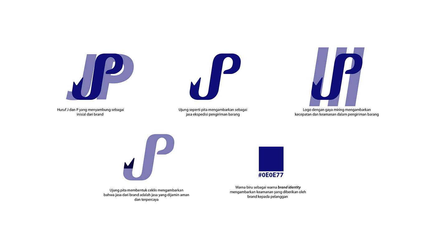
Jaspit ID bridges the geographical gap for consumers as a premier shopping proxy service. The logo was therefore designed to instantly visualize the core of their business: the ability to 'get' any desired item with trust and speed. These principles are translated into a unique 'JP' monogram. The letter 'J' is stylized as a fish hook, cleverly symbolizing Jaspit ID's ability to 'hook' or acquire sought-after products for its customers. It then seamlessly integrates with the letter 'P', creating a dynamic flow that represents an efficient and smooth shipping process. Combined with a deep blue color that inspires trust and professionalism, the logo stands as a symbol of Jaspit ID's promise: a reliable service that puts products from across the nation right at your fingertips.